
If you have ever brought home a flat of “pretty” flowers and then felt like your bed looked a little… loud, you are in good company. Color is powerful. It is also surprisingly learnable. Once you understand a few basics from the color wheel, you can build flower beds that feel intentional, calming, dramatic, cottagey, modern, or whatever mood you want to step into after a long day.
My grandmother used to say, “Pick your main color like you pick a dress, then choose the jewelry.” In garden terms, that means choose an anchor color (or two), then use supporting colors, foliage, and repeats to make everything look like it belongs.
The color wheel basics
The color wheel is a map of how colors relate. In gardens, it helps you predict whether a planting will feel harmonious or high-energy.
- Warm colors (reds, oranges, yellows) tend to feel energetic and closer to the eye. They can make a small space feel cozy but can also feel busy if overused.
- Cool colors (blues, purples, and cool-leaning pinks) tend to feel calmer and often recede visually, which can make a bed feel deeper.
- Neutrals (white, cream, pale green, silver foliage, and even soft beige seedheads) act like breathing room between stronger colors.
A gardener’s shortcut: If you are overwhelmed, start with one main color family plus green foliage. You can always add a contrasting pop later.
Start with a mood
Before you pick specific varieties, decide what you want the space to feel like. This one step prevents the classic cart-full-of-random-blooms situation.
- Peaceful and airy: whites, pale pinks, lavender, light blues, silver foliage
- Bold and festive: hot pink, orange, red, bright yellow with strong repeats
- Elegant and modern: a tight palette like white plus deep purple, or chartreuse plus burgundy
- Romantic cottage: soft pinks, mauves, purples, creams, with plenty of green and a few airy fillers
If you can describe the vibe in one sentence, your color choices get much easier.
Three easy schemes
These are the training wheels that still look like a pro designed your bed.
Complementary
Complementary colors sit opposite each other on the wheel. Think purple and yellow, blue and orange, or red and green (green shows up as foliage, which is why red flowers look so punchy in gardens).
How to make it look intentional: Use one color as the main character and the opposite color as the accent. A 70/30 split is a helpful rule of thumb.
- Easy pairing: Purple salvia with yellow coreopsis
- Easy pairing: Blue catmint with orange calendula (best where calendula blooms in spring or early summer)
- Easy pairing: Blue catmint with orange tithonia (full sun and real heat help it shine)
- Easy pairing: Burgundy dahlias with chartreuse coleus foliage

Analogous
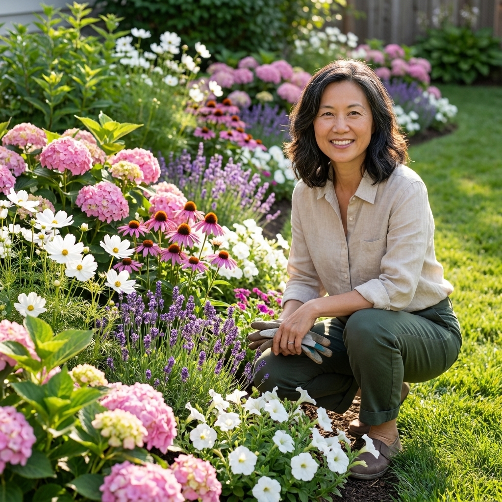
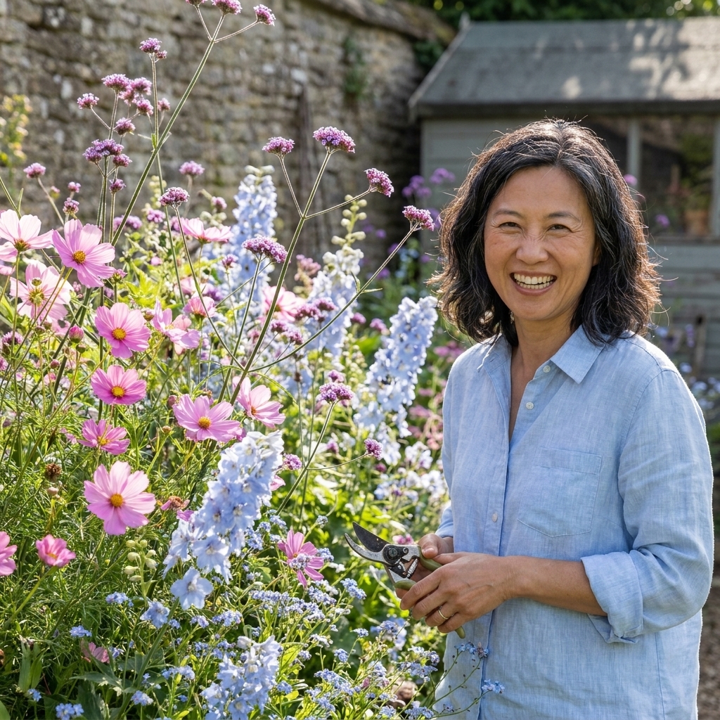
Analogous colors sit next to each other on the wheel, like pink, purple, and blue or yellow, orange, and red. This is the scheme I recommend most often for beginners because it is forgiving and naturally cohesive.
How to make it pop: Add a neutral (white blooms or silver foliage) and repeat one color several times along the bed.
- Easy pairing: Pink zinnias, purple verbena, and blue ageratum
- Easy pairing: Peach roses with apricot yarrow and yellow daylilies
- Easy pairing: Purple-pink coneflowers (Echinacea) with blue globe thistle and white shasta daisies
Monochromatic
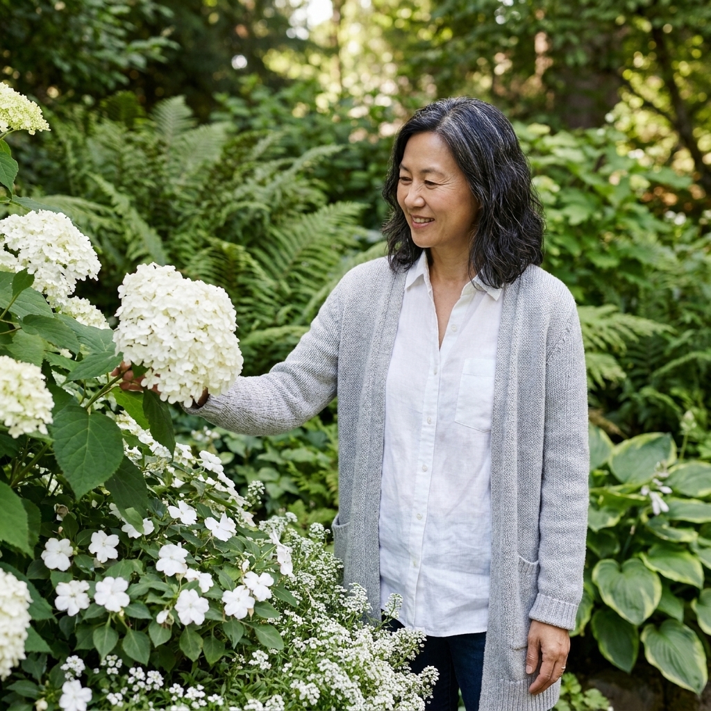
Monochromatic palettes use different tints and shades of a single color. They can look incredibly polished, especially in small front beds, containers, and along walkways.
How to keep it from looking flat: Mix texture (spikes, daisies, round blooms), height, and leaf shape. Also mix pale, mid, and deep tones of the same color family.
- All white: white hydrangea, white nicotiana, white alyssum, with silver dusty miller
- All purple: lavender, purple salvia, deep violet petunias, purple basil foliage
- All pink: pink roses, pink dianthus, pink gaura, blush snapdragons
Foliage does the work
Flowers get all the glory, but foliage is what makes a palette hold together for months. If your bloom colors feel chaotic, you can often fix the design by repeating foliage tones and textures.
- Deep green reads classic and makes bright flowers look brighter.
- Chartreuse (lime green foliage) energizes a bed and pairs beautifully with purple, blue, and hot pink.
- Silver and blue-green foliage calms everything down and is a lifesaver in high-contrast palettes.
- Burgundy foliage adds depth and makes softer bloom colors feel richer.
Some dependable foliage players: coleus, heuchera (coral bells), artemisia, lamb’s ear, dusty miller, ornamental grasses, and hardy herbs like sage and thyme.
Undertones matter
Here is the sneaky reason “close enough” sometimes clashes: undertones. A pink can lean blue (cool) or peach (warm). A red can lean magenta or brick. Purples can tilt toward blue-violet or red-violet. If two plants feel weird together, look for that warm-versus-cool mismatch.
Quick fix: When you want a blended look, keep undertones in the same direction. When you want contrast, mix undertones on purpose and add a neutral between them.
Light changes color
This is the part no one tells you at the garden center under those bright greenhouse lights.
- Full sun can intensify color, and it can also bleach it. Hot pinks and oranges may look extra vivid in bright light, while some pale blooms can fade in intense midday sun.
- Shade softens color. Pale blooms glow, while very dark colors (deep red, near-black purple) can disappear at dusk.
- Distance matters. From the curb, subtle pastel differences can blur together. Strong blocks of one color read better from far away.
If you are designing a bed you mostly see from indoors, walk to that window and imagine the palette from that exact viewpoint.
Massing makes it read
Color works best in clumps. One lonely orange marigold in a sea of purple looks accidental. Three small drifts looks like design.
- Group the same plant in repeats (even just 3 to 5 plants together) so the color reads as a block.
- Use fewer varieties, planted more generously, for a calmer look.
- Let filler plants knit the gaps so you do not get a spotty, polka-dot effect.
Plan for bloom time
A color scheme is only as good as its timing. If all your purple blooms happen in May and your yellows show up in August, the palette is really two different beds in different months.
Try this simple approach:
- Pick your scheme (complementary, analogous, or monochrome).
- Choose one plant for each season you want color: spring, early summer, late summer, fall.
- Repeat at least one reliable bloomer (or foliage plant) across multiple seasons to keep continuity.
Example: purple and yellow, season-spanning
- Spring: purple allium, yellow daffodils
- Early summer: purple salvia, yellow yarrow
- Late summer: purple-pink coneflower (Echinacea), yellow rudbeckia
- Fall: purple asters, yellow goldenrod or chrysanthemums
Two design tricks
1) Repeat on purpose
Designers repeat colors and plants the way songwriters repeat a chorus. If you use coral once, it looks accidental. If you use coral three times, it looks like you meant it.
- Repeat the same plant in drifts.
- Repeat the same color in different plants (for example, purple salvia plus purple verbena).
- Repeat a foliage tone (chartreuse or silver) to tie seasons together.
2) Add a resting color
White, cream, pale pink, or silver foliage gives your eyes a place to rest. It is the difference between a bouquet that feels lush and one that feels frantic.
Ready-to-copy palettes
If you want to skip decision fatigue, here are a few palettes that work in many home gardens. Swap in plants that fit your zone and sun exposure, but keep the color relationships.
Calm cottage
Analogous: pink, purple, blue
- Catmint (blue-lavender)
- Verbena (purple)
- Cosmos or zinnia (pink)
- White alyssum (neutral filler)
- Artemisia or lamb’s ear (silver foliage)
Front-yard wow
Complementary: purple and yellow
- Salvia (purple)
- Coreopsis or rudbeckia (yellow)
- Heuchera with dark leaves (depth)
- Ornamental grass (texture and movement)
Modern and crisp
Limited palette: white + green
- White hydrangea or white roses (structure)
- White nicotiana or white petunias (summer fill)
- White gaura (airiness)
- Boxwood or similar evergreen (clean lines)
Easy shade
Limited palette: white + chartreuse + deep plum
- White impatiens or white begonias (bright blooms for shade)
- Heuchera with deep plum leaves (rich contrast)
- Chartreuse coleus (glow and repeat)
- Hosta (big, calming leaf mass)

Common mistakes
- Mistake: Too many colors, not enough repeats.
Fix: Pick 2 to 3 main colors and repeat each at least three times, ideally in clumps. - Mistake: Everything is equally saturated.
Fix: Mix one bold color with softer tints, plus a neutral like white or silver. - Mistake: Dark flowers vanish.
Fix: Pair deep blooms with lighter companions nearby, or place dark colors where you see them up close. - Mistake: The palette looks great for two weeks only.
Fix: Add long-bloomers (salvia, zinnias, cosmos, coreopsis) and strong foliage plants for continuity.
If you are feeling personally attacked by any of the above, please know I have composted my way through all of them. More than once.
Quick FAQ
How many colors should I use?
For a cohesive look, aim for 2 to 3 main colors, plus green foliage and optionally one neutral (white or silver). You can add more variety through texture and plant form instead of adding more colors.
What is easiest for beginners?
Analogous (colors next to each other, like pink, purple, blue) is the most forgiving. It blends naturally, even if your exact shades are not perfectly matched.
What about small spaces or containers?
Go monochromatic (one color family) or use one strong color plus white. Small spaces look best with fewer colors and more repetition.
Do I need exact matches?
No. In real gardens, “close enough” is usually beautiful. Focus on temperature (warm versus cool), keep undertones friendly when you want harmony, add neutrals, and repeat your main hues.
Try this this weekend
If you want a low-stress assignment: pick one palette and try it in a single bed edge or a set of containers. Take a photo from the same spot each week. You will start noticing what the color wheel predicts and what your own eyes prefer, which is the only right answer that matters.
And if you end up with one oddball marigold that does not match anything, welcome. Every seasoned gardener has a compost bin full of past mistakes, and at least one stubborn flower that refuses to follow the design plan.